[sigh] And to think. I thought my days of doing these were behind me.
A quick sphere, black colored pencil.
Silly me.
You know you're showing your age (or something), when you start saying things like,
"Hey, if you think doing these grey scales is tedious, think about this:
We had to render white cubes on a white table on a white background.
Just a cube, by itself.
Every week.
For 6 weeks! ..."
Their eyes bug out and I know they're wondering, "Woo. Can she be serious?"
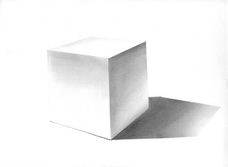
(Dirty) white cube. Charcoal with Webril pad. 1996
I know I did better versions of them, but they're off, hiding somewhere.
Light and shade, core and shadow. Where's the light source?
The only light source I'm going to worry about for a few days is that really big, bright one up in the sky. Partly cloudy and windy here for the weekend, but Santa Barbara is s'posed to be sunny... That could be promising ... It's a tempting thought. But so is napping on the couch and decompressing from another long week.
Wherever you are, have a great Girls' Day and L.A. Marathon weekend out there.
-w
Friday, March 02, 2007
Geometric forms
Posted by
Wendee
at
12:28:00 PM
![]()
Subscribe to:
Post Comments (Atom)


4 comments:
I love these !...sometimes going back to the basics can be liberating...
I'd love to frame these and hang em on a wall.. with one drop of a color somewhere on each.. and people would wonder..is it there on purpose? teehee...just the evil guy I am..
Beautiful rendering, Wendee. Now I've got a question that maybe you can answer that's been bugging me from my wc class. We've done rendering of geometric forms, too, using dilute black watercolor. Why is the face on vertical side facing the light source dark at the top but lighter at the bottom. Is it the reflected light up from the table that causes it? Would it be different if it was a white cube on a black table?
Thanks MrMom. I should send my stuff over your way for embellishment and display, rather than have them crammed into storage...
Thanks Karen. You ask that dreaded question, "Why?". You know, I've had to give some reasons for this in class. I asked "Why?" too, and got some pretty much straight answers that I'll summarize. Kinda sneaky, actually. I'm going to draw up a little schematic and post it. The short answer is, though, yes, what you suggest (light reflected up from the table). The sneaky artsy answer, though, is if you have a choice, and either seems to work visually, chose the one that most helps define edges and form... A little less about strict rendering of what you might see, a little more broad application of artistic license to help you depict what you want to convey...
Post a Comment